Brand guidelines
Bundleloom’s logo, colours, type, voice and the components shoppers see. If something is missing or unclear, write to destek@bundleloom.com.
Logo
The symbol is three stacked boxes: 1, 2 and 3 items. The lime box on top is the extra item the shopper adds, and that box is the whole story. In the wordmark the “oo” is two linked rings: products tied into a bundle.
Clear space
Keep at least one box height (x) of space on every side. No text, edge or image enters that area.
Minimum size
Use the full logo at 96 px wide or more. Below that, use the symbol alone; it reads down to 16 px. Under 40 px the rings simplify (no interlock gap).
Files
- Logo, light background
bundleloom-logo.svg - Logo, dark background
bundleloom-logo-ters.svg - Logo, cobalt background
bundleloom-logo-kobalt-zemin.svg - One colour, ink
bundleloom-logo-tekrenk.svg - One colour, white
bundleloom-logo-tekrenk-beyaz.svg - Wordmark only
bundleloom-yazi.svg - Symbol
bundleloom-simge.svg - Symbol, one colour
bundleloom-simge-tekrenk.svg - Shopify app icon, 1200 px
bundleloom-shopify-ikon-1200.png - Email signature, PNG
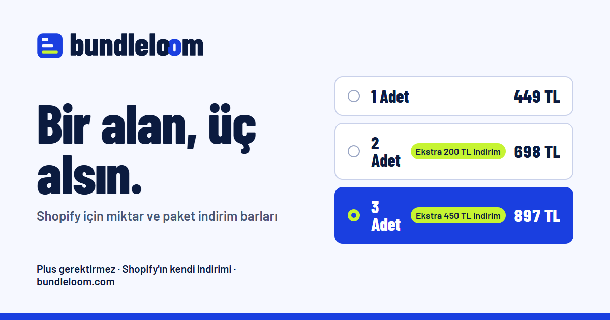
bundleloom-logo-eposta.png - Share image, Turkish
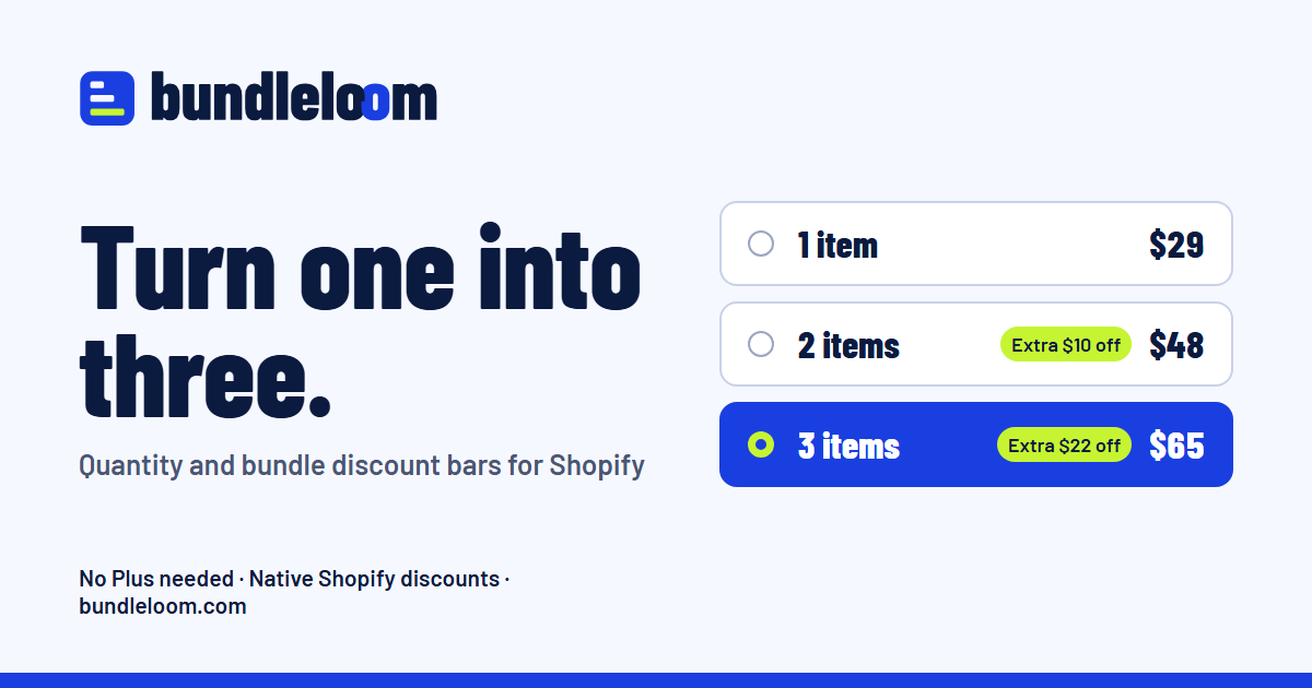
og-tr.png - Share image, English
og-en.png









Files are regenerated by web-kaynak/bundleloom_marka.py; do not edit them by hand.
Misuse
Colour
Cobalt carries trust and the calm of a native Shopify discount; lime lights up only where the shopper gains. The palette stays clear of the sibling apps (Yorumix raspberry, Swatchloom purple, Paysorty teal) and Oxmira’s amber.
Cobalt
#1A3FE0RGB 26, 63, 224Primary. Buttons, selected bar, links, large colour fields.
Lime
#C6F432RGB 198, 244, 50The gain accent: discount tags, gifts, upgrade strip. Only with ink text or on dark grounds.
Ink
#0B1B3FRGB 11, 27, 63Text, dark surfaces, add-to-cart button.
Paper
#F6F8FFRGB 246, 248, 255Page background. One step cooler than white.
Proportion
Paper 60% · Ink 25% · Cobalt 10% · Lime 5%. Lime appears in two or three places per page at most.
Supporting tones
- Cobalt dark
#1B33C4Link and button hover - Cobalt light
#E3E8FFSelected bar fill, alternate section - Slate
#4A5675Secondary text, derived from ink rather than neutral grey - Rule
#C9D1EABorders and dividers
Contrast (WCAG 2.2)
| Sample | Text / ground | Ratio | Level | Use |
|---|---|---|---|---|
| Aa 200 | #0B1B3F / #F6F8FF | 15.92:1 | AAA | Body text / headings on paper |
| Aa 200 | #0B1B3F / #FFFFFF | 16.90:1 | AAA | Body text on white cards |
| Aa 200 | #4A5675 / #F6F8FF | 6.87:1 | AA | Secondary text on paper |
| Aa 200 | #4A5675 / #E3E8FF | 5.99:1 | AA | Secondary text on light cobalt |
| Aa 200 | #1A3FE0 / #F6F8FF | 6.99:1 | AA | Links / cobalt headings on paper |
| Aa 200 | #1A3FE0 / #FFFFFF | 7.42:1 | AAA | Links on white cards |
| Aa 200 | #FFFFFF / #1A3FE0 | 7.42:1 | AAA | Button label on cobalt |
| Aa 200 | #0B1B3F / #C6F432 | 13.19:1 | AAA | Badge text on lime |
| Aa 200 | #C6F432 / #0B1B3F | 13.19:1 | AAA | Lime accent on ink |
| Aa 200 | #F6F8FF / #0B1B3F | 15.92:1 | AAA | Text on ink (reversed) |
| Aa 200 | #C6F432 / #1A3FE0 | 5.79:1 | AA | Lime large type / icons on cobalt |
| Aa 200 | #1B33C4 / #F6F8FF | 8.54:1 | AAA | Link hover |
| Aa 200 | #0B1B3F / #E3E8FF | 13.88:1 | AAA | Text on selected row |
Body text is always AAA (above 7:1). Lime is never a text colour on light grounds. Under protanopia, deuteranopia and tritanopia simulation cobalt, lime and ink stay distinct; the selected bar is also marked by a heavier border and a filled radio, never by colour alone. Measured with python web-kaynak/bundleloom_palet.py.
Typography
Barlow Condensed 800
Turn one into three.
AaBbÇçĞğİıÖöŞşÜü 0123456789 ₺ $ %
Headings, prices, quantities and badges. Narrow and heavy, like a label on a carton: says a lot in little space.
Barlow 400 / 600
Shoppers pick a bundle and the discount lands in the cart as a native Shopify discount.
AaBbÇçĞğİıÖöŞşÜü 0123456789
Body copy and UI. The wide cut of the same family, sharing one skeleton with the headings.
| Role | Face | Size / line |
|---|---|---|
| Display | Barlow Condensed 800 | 54–96 px / 0.95 |
| Section | Barlow Condensed 800 | 37–58 px / 0.95 |
| Subhead | Barlow Condensed 800 | 24 px / 1.1 |
| Body | Barlow 400 | 17.5 px / 1.6 |
| Small | Barlow 400 / 600 | 14 px / 1.4 |
Prices and counts use tabular figures (font-variant-numeric: tabular-nums) so rows hold still when prices change. Fonts are SIL Open Font License, served from our own host, no external CDN.
Iconography
24 px grid, 2 px stroke, rounded joins and caps. Icons take the text colour (currentColor); for emphasis, draw lime inside an ink tile. Emoji and glyphs never stand in for icons.
Voice
Bundleloom talks like a good shop assistant: says the price, says the saving, stops. Short sentences, concrete numbers, what goes in the merchant’s pocket. No exclamation marks, no hype, no “revolution”.
| Principle | Say | Not |
|---|---|---|
| Short | The discount lands in the cart on its own. | Thanks to our advanced discount engine, all of your discounts are automatically applied at the cart stage. |
| Plain | 2 items picked: $48, $10 off. | Great choice! You just unlocked an amazing deal! |
| Merchant gain | Shoppers take a second one, and you see it in the cart. | The world’s most powerful bundle app. |
| Honest | If stock runs short, the 3-item bar hides. | You will never miss a sale. |
- Storefront copy speaks in actions: “Add 1 more”.
- Admin copy addresses the merchant directly and uses Shopify’s own names (Discounts, Theme editor).
- Currency: “1.347 TL” in Turkish, “$65” in English.
Components
These are the storefront components themselves, sharing CSS with the live demo on the home page.
Bundle block
Badges
Extra $10 offMost popular17% offLast 2 left
Buttons
Save bundlePreviewAdd to cart · $48
Cart upgrade strip
Add 1 more, save $10
AddAdd 1 more, save $12 more
AddYour cart has the best bundle price.
- Selected bar: 2 px cobalt border, light cobalt fill, filled radio. Unselected: 1.5 px rule-colour border.
- Discount tag is lime; the “most popular” ribbon is lime on ink. One ribbon per block at most.
- A bar without stock gets a hatched fill, dashed border and an explanation line, not just a fade.
- Corners: bars and cards 14 px, buttons 10–12 px, badges fully round.
Imagery
Photography
- Real products, daylight, plain paper or light cobalt backdrops. Items stacked or lined up in ones, twos and threes: the count must be readable in every frame.
- No busy scenes, stock-photo smiles or artificial sparkle.
- Screenshots come from a real store with real prices; no blurred fake data.
Illustration
- Flat colour, rounded boxes, no gradients or 3D. The third pack carries a lime band, echoing the extra box in the logo.
- Real UI fragments can stand in for illustration: a real bar, a real strip.
Space and grid
An 8 px scale. Tight inside groups (8–16), generous between them (48–128). More space above a heading than below it.
4812162432486496128
Content max 1160 px, 12 columns, 24 px gutters (16 px under 640 px). Reading measure 62–72 characters. Shadows only on raised surfaces: offset and soft, never a coloured halo.